Lite Graph - ComfyUI Settings Menu
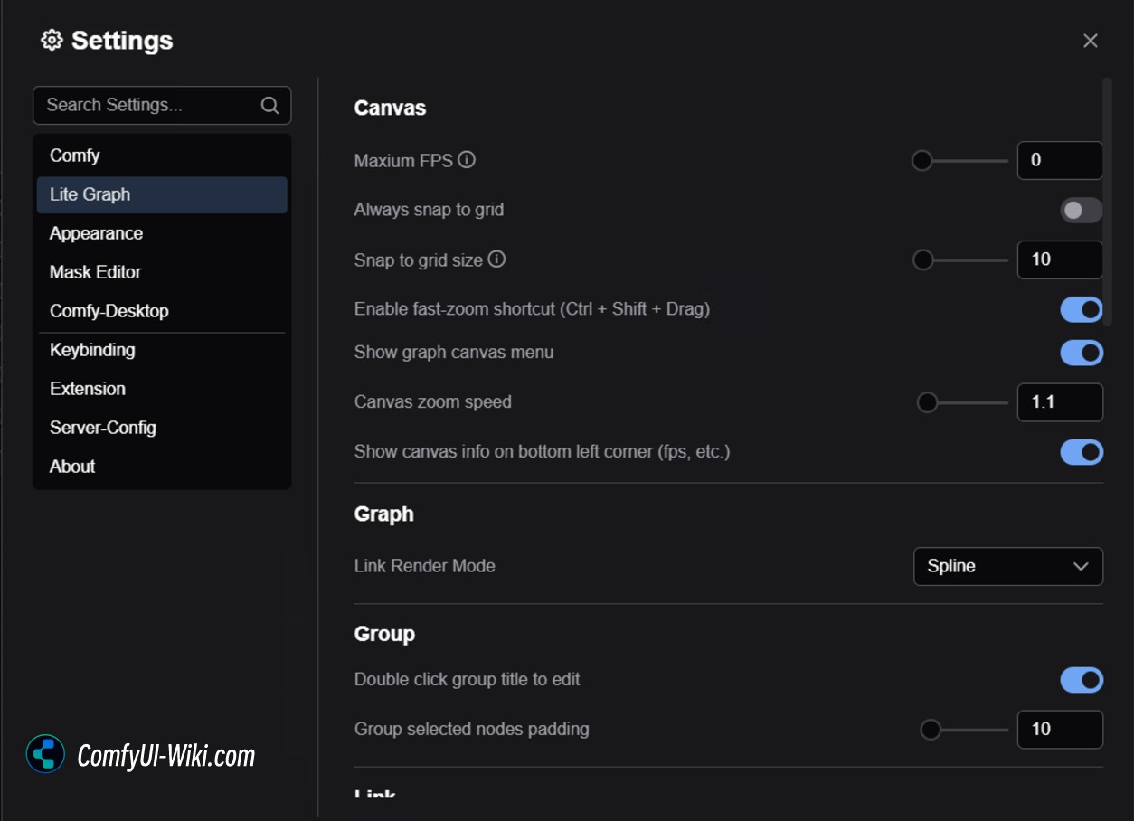
This chapter introduces the canvas and graph-related settings in ComfyUI. These settings help you customize and optimize your workflow editing experience.
Canvas
Maximum FPS
Controls the maximum refresh rate of the canvas. Setting it to 0 means no FPS limit.
Snap to Grid
- Always snap to grid: When enabled, nodes will automatically align to the grid when moved.
- Grid size: Sets the size of the grid, default value is 10.
Fast-zoom Shortcut
When enabled, you can use Ctrl + Shift + Left Mouse Button (drag up/down) to quickly zoom the canvas.
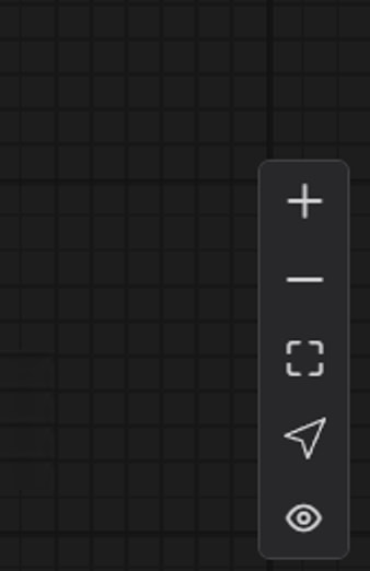
Graph Canvas Menu
Hide or show the canvas menu in the bottom right corner of the interface.
Canvas Zoom Speed
Controls the zoom speed when using the mouse wheel. Higher values result in faster zooming of the workflow and interface.
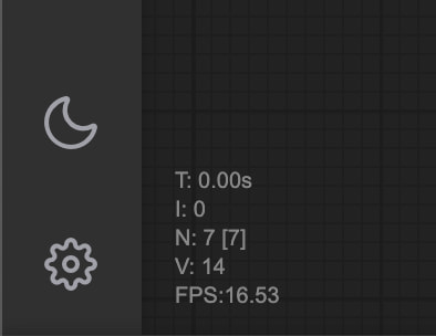
Show Canvas Info
Displays canvas information (such as FPS) in the bottom left corner.
Graph
Link Render Mode
Sets how connections between nodes are displayed
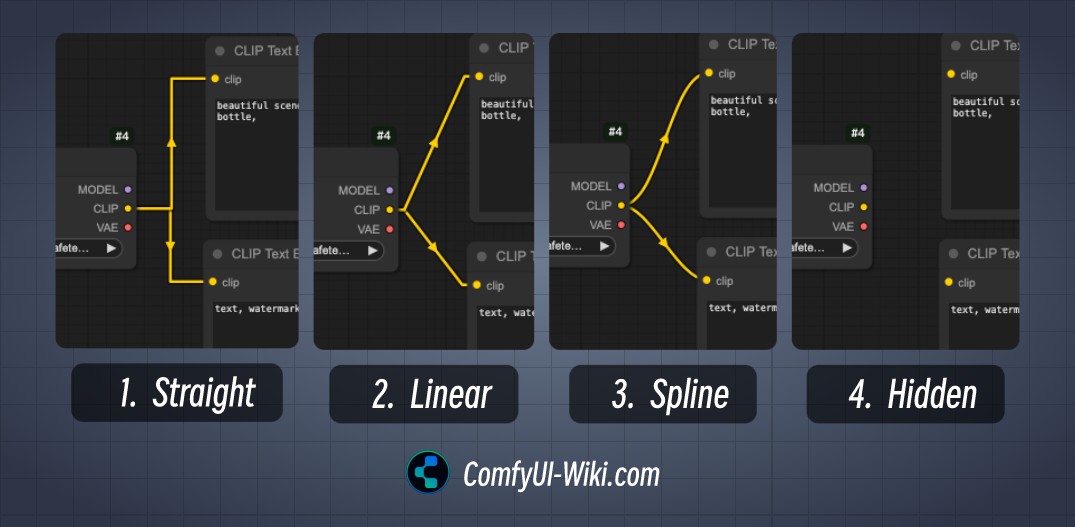 The link render modes include:
- Straight
- Linear
- Spline
- Hidden
Link visibility can be quickly toggled through the Canvas Menu
Group
Double Click Group Title to Edit
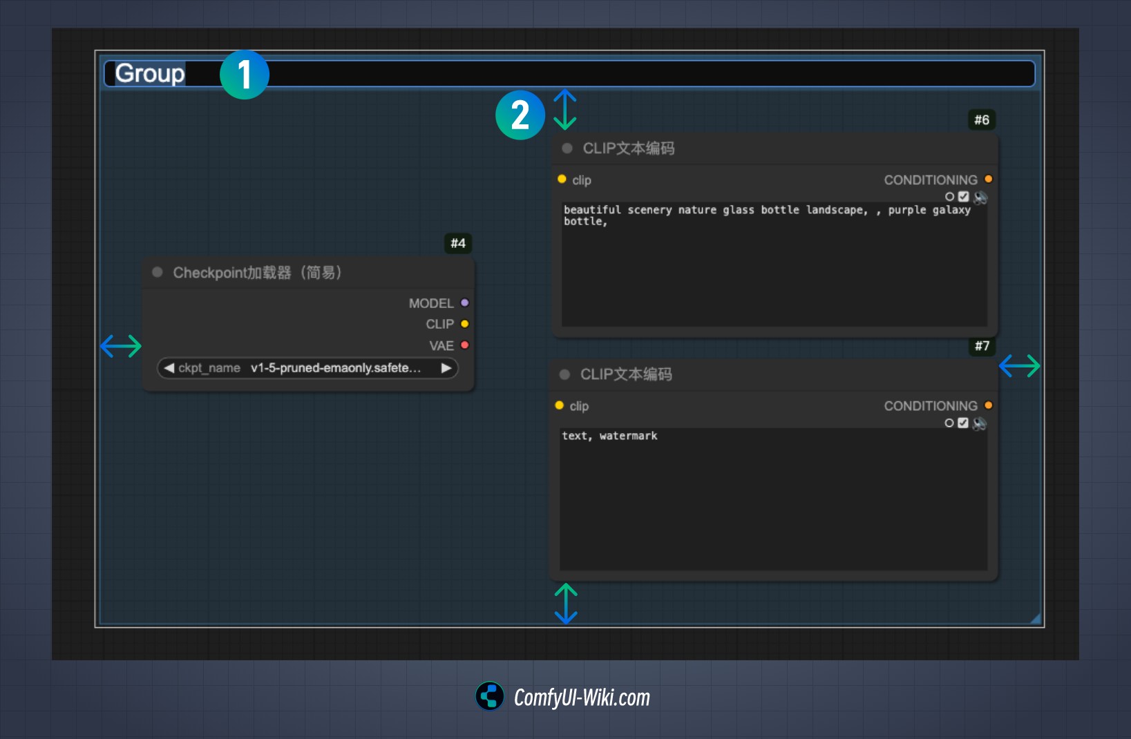
When enabled, you can edit group titles by double-clicking them. As shown in the image, number 1 indicates the editable state of the group title.
Group Selected Nodes Padding
Sets the internal padding for grouped nodes, as shown by number 2 in the image. When you select multiple nodes and group them using Ctrl + G, this value determines the default padding.
Link
Link Midpoint Markers
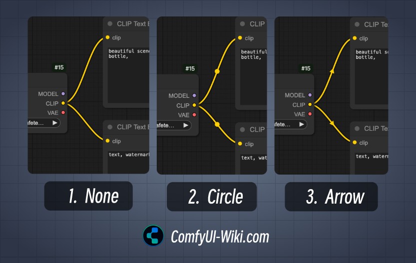 This option affects the style of link midpoint markers, with three display options:
- None
- Circle
- Arrow
Link Release
These settings configure quick actions when releasing connections, with different behaviors based on whether the Shift key is held:
- Context Menu
Brings up a context menu with quick actions and compatible nodes for the current node’s output/input connections.
- Search Box
Opens a search box that includes the current output/input conditions for quick filtering of compatible nodes.
- None No action is taken.
Action on Link Release (Shift)
Sets the action when releasing a connection while holding Shift
Action on Link Release (No modifier)
Sets the action when releasing a connection without any modifier keys
Menu
Invert Context Menu Scrolling
Changes the scrolling direction of the right-click menu.
Node
Many settings in this section weren’t clearly understood during testing. If you understand how these features work, please feel free to add explanations in the comments. Most of these are convenience and shortcut settings, so keeping them at default values is generally fine.
DOM Element Clipping
Enable DOM element clipping (may affect performance).
Middle-click Creates Reroute Node
Use middle mouse button click to create new reroute nodes.
Keep All Links When Deleting Nodes
Links connected to a node won’t be automatically deleted when the node is removed. Attempts to reconnect all input and output links when deleting a node (similar to bypassing the node).
Snap Highlights Node
Shows highlight indicators when nodes snap to the grid.
Auto Snap Link to Node Slot
Automatically snaps connections to the nearest node slot.
Enable Tooltips
Shows hover tooltips for nodes.
Node Life Cycle Badge
Shows the node’s lifecycle state.
Node ID Badge
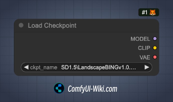
Displays unique node identifiers, showing labels like #1 to indicate the order in which nodes were added to the workflow.
Node Source Badge
Shows the source information, indicating which custom node the node comes from.
Double Click Node Title to Edit
When enabled, allows editing node titles by double-clicking them.
Node Widget
Float Widget Settings
- Decimal places: Sets the number of decimal places shown (0 for automatic).
- Disable default rounding: Disables the default rounding behavior for float values.
Disable Node Widget Sliders
In ComfyUI nodes, when a node option is of type Float, you can click and drag the input arrows to quickly adjust values.
Enabling this option will disable the slider functionality.
Preview Image Format
When displaying images in components, you can set this option to convert preview images to lighter formats for smoother interface performance. Supported formats: webp, jpeg, webp;50, etc.
Pointer
Double Click Interval
Sets the maximum time interval for recognizing double-click events (default 300 milliseconds).
Pointer Click Drift (Beta)
- Click drift delay: 150 milliseconds
- Maximum drift distance: 6 pixels
Reroute Beta
Enable Reroute Beta Test
When enabled, you can hold the Alt key (Option key on Mac) and click on node connections to quickly add a junction point. See the video below for demonstration: