Appearance Menu - ComfyUI Settings Menu Description
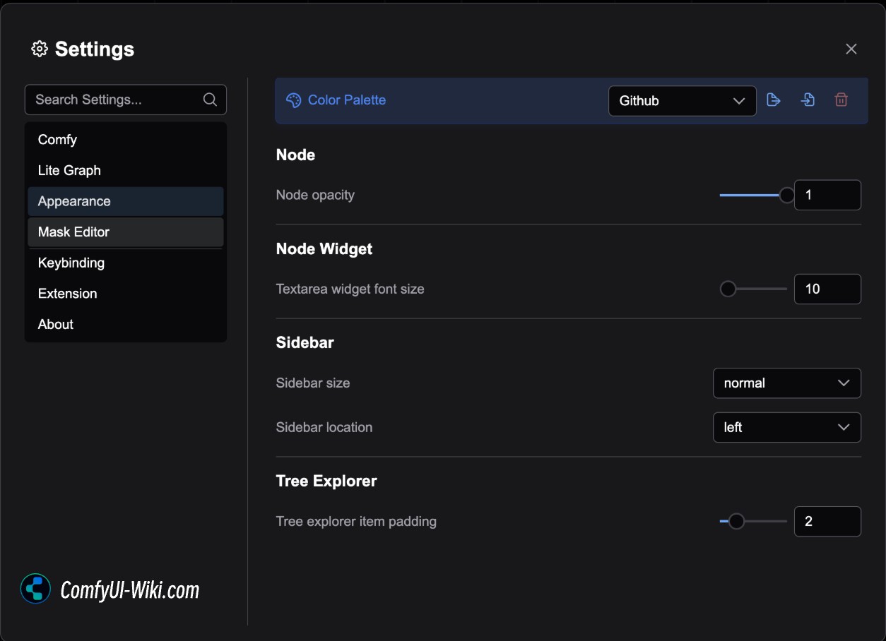
Color Palette
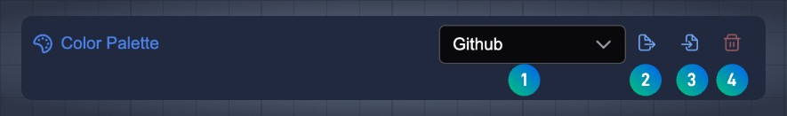 The color palette is mainly used for the overall color theme configuration of ComfyUI, corresponding to the following menu functions:
- Switch ComfyUI theme
- Export the currently selected theme as a
Jsonformat - Load custom theme configuration from a
Jsonfile - Delete custom theme configuration
The currently preset themes mainly include:
- Dark Theme
- Light Theme
- Arc Theme
- Solarized Theme
- Nord Theme
- Github Style Theme
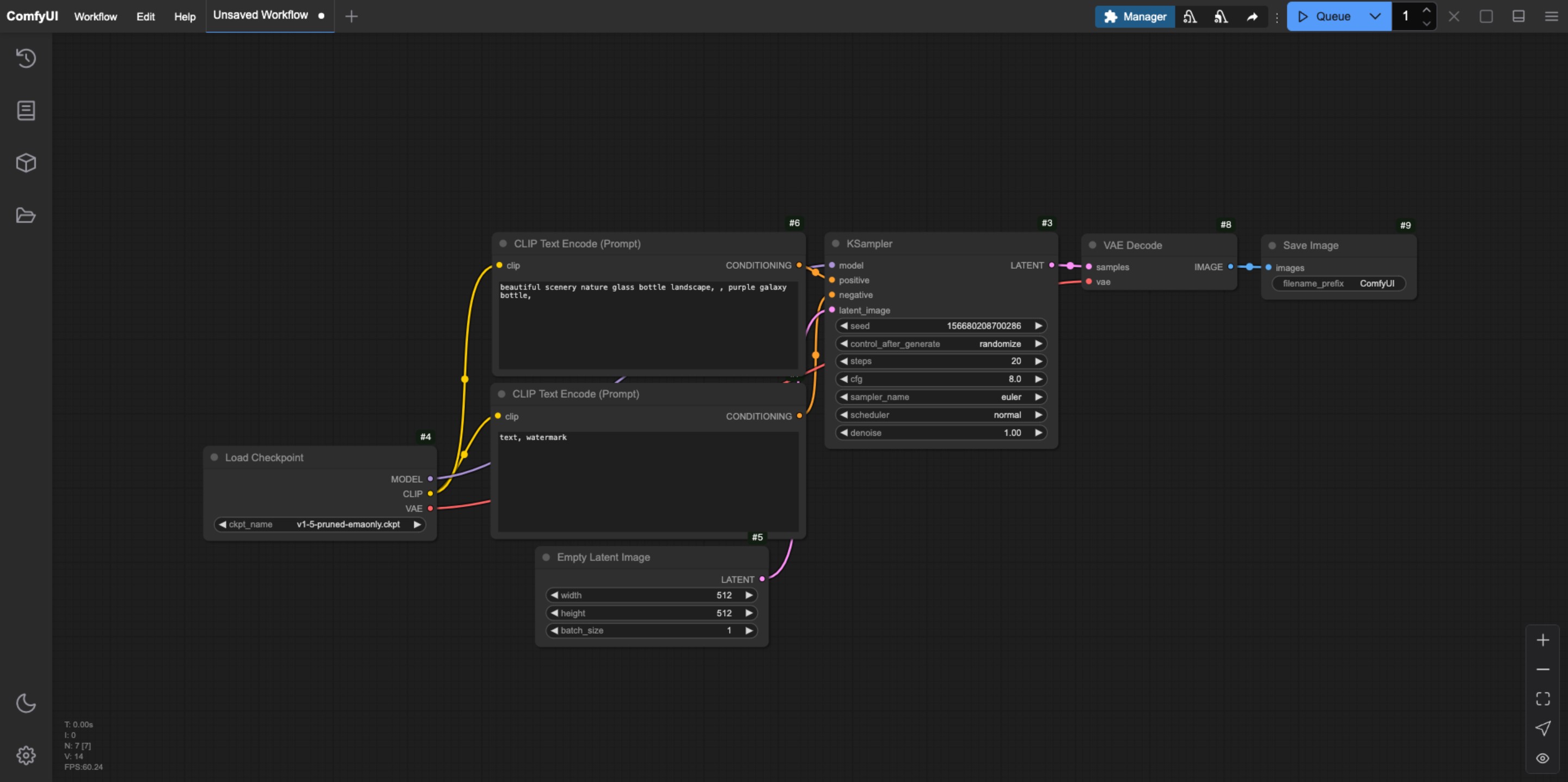
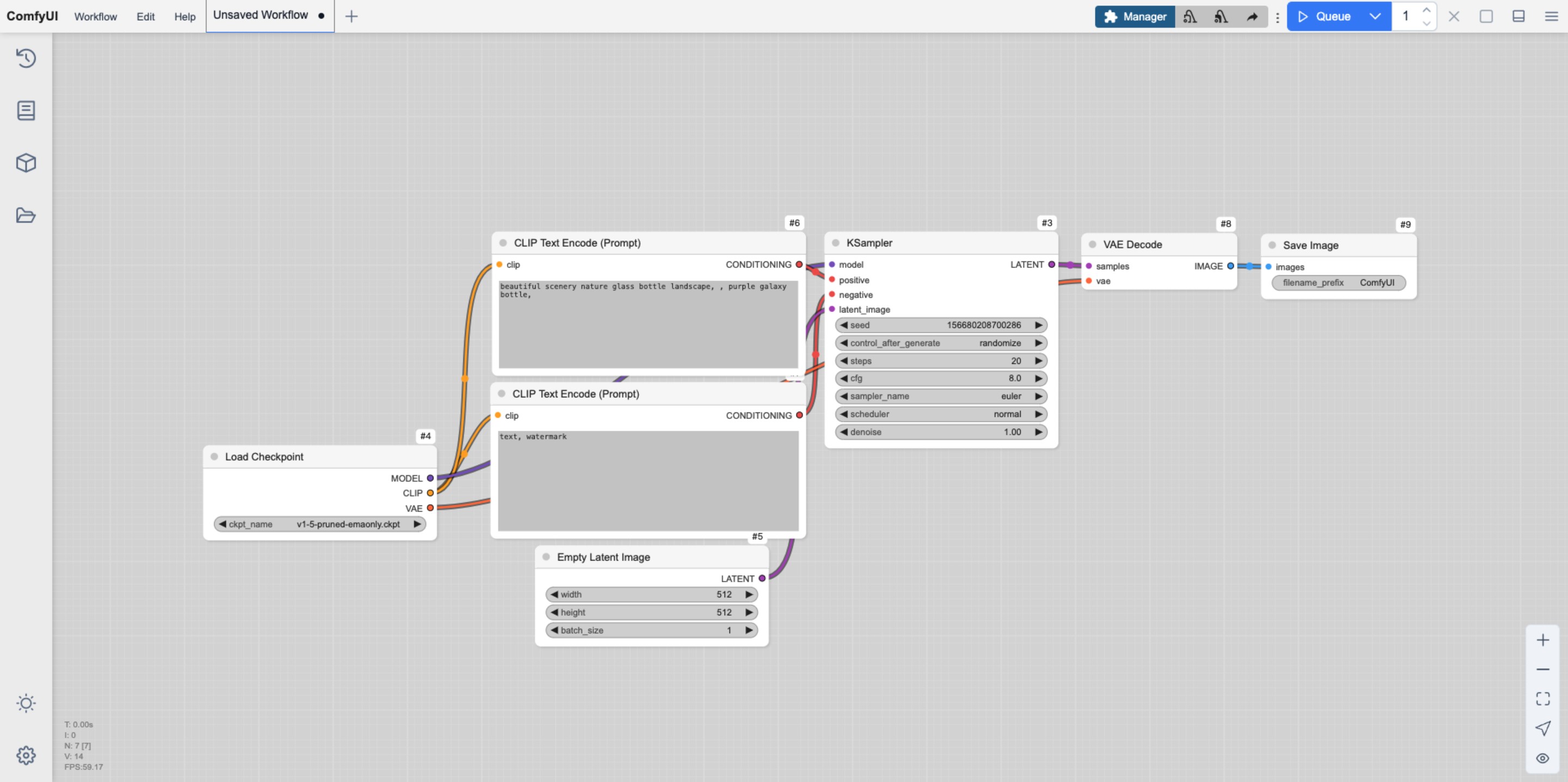
Preview of Preset Theme Styles
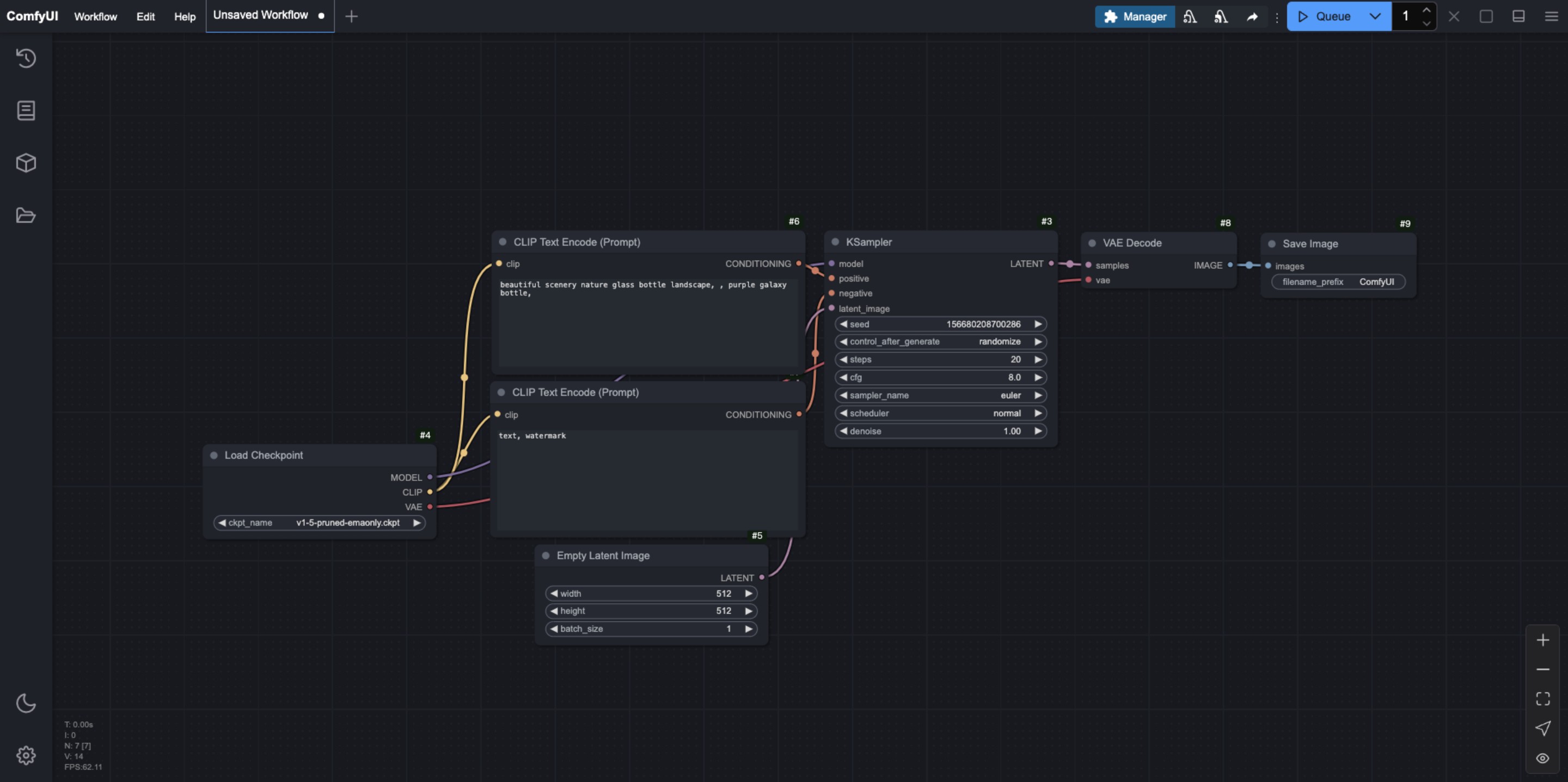
Dark Theme
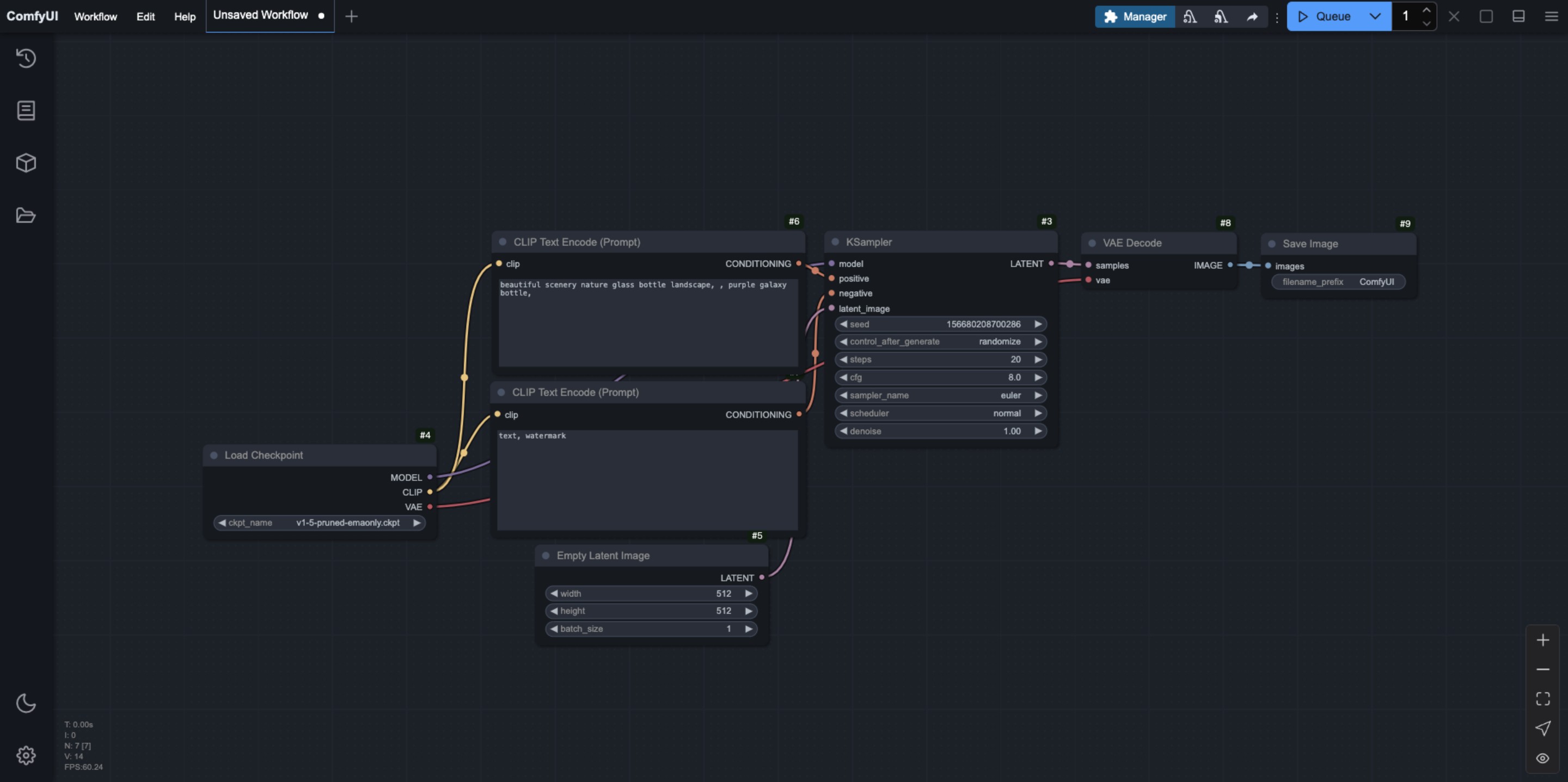
Light Theme
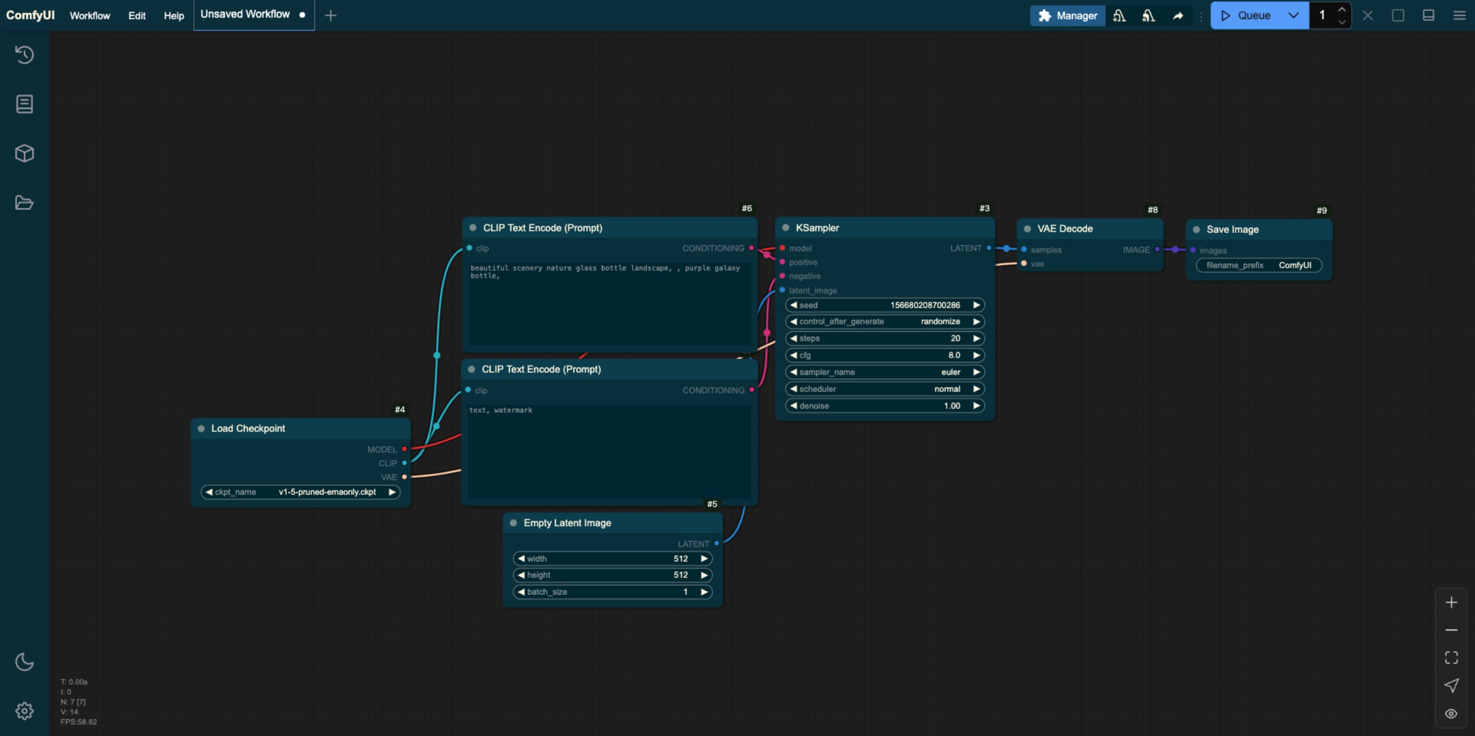
Arc Theme
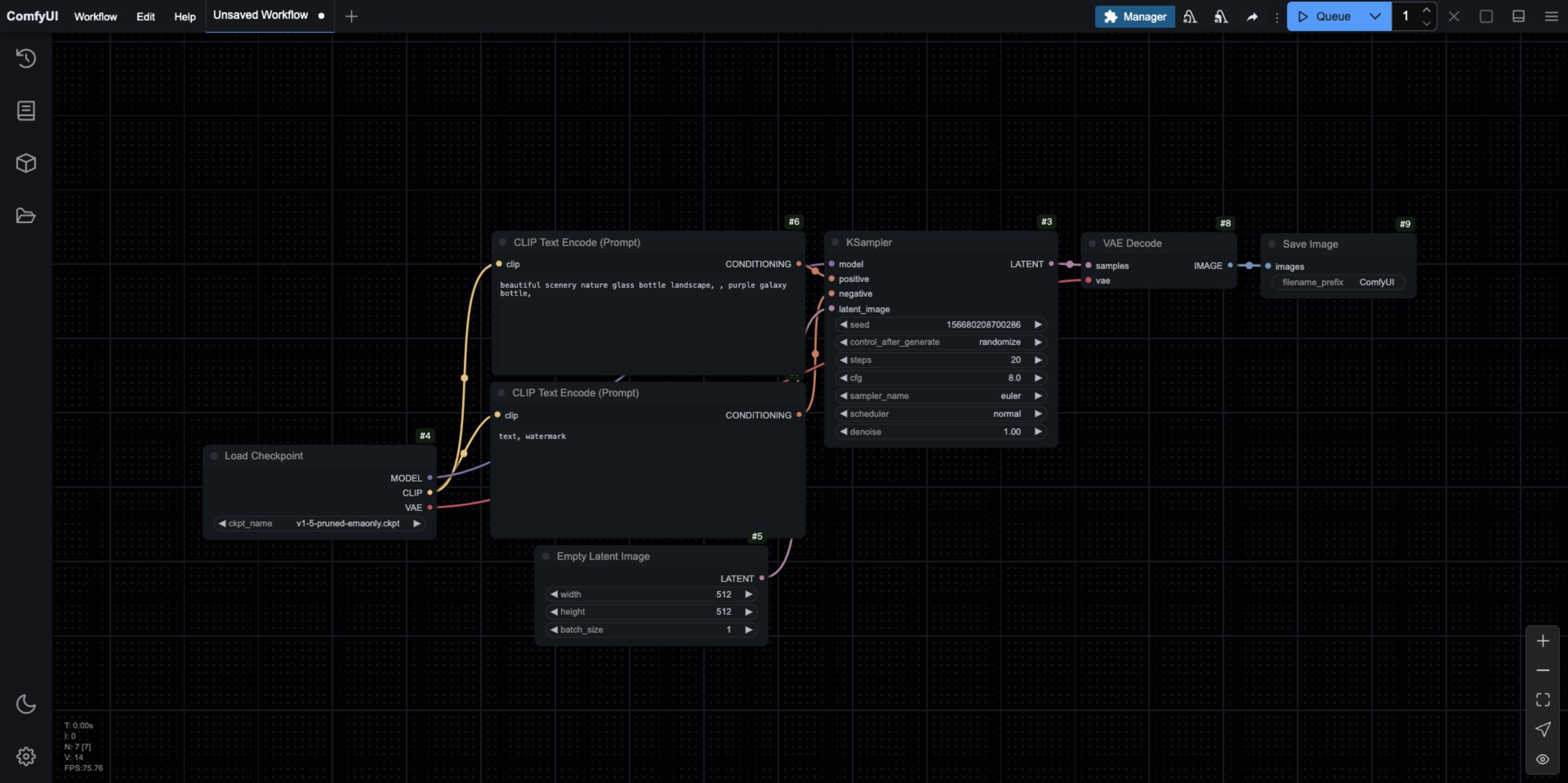
Solarized Theme
Nord Theme
Github Style
How to Customize ComfyUI Theme Styles
You can customize the ComfyUI styles by exporting and editing the default theme file. You can use a text editor or an IDE like VS Code to edit the corresponding Json file.
When editing, please ensure that the content format is correct, and the corresponding id names should be unique. Below is the Json of the exported ComfyUI Light theme interface, which you can refer to for modification. Additionally, since ComfyUI is constantly being updated, the configuration below may not be the latest version. It is recommended to export from the ComfyUI interface for modification.
{
  "id": "light",
  "name": "Light",
  "light_theme": true,
  "colors": {
    "node_slot": {
      "CLIP": "#FFA726",
      "CLIP_VISION": "#5C6BC0",
      "CLIP_VISION_OUTPUT": "#8D6E63",
      "CONDITIONING": "#EF5350",
      "CONTROL_NET": "#66BB6A",
      "IMAGE": "#42A5F5",
      "LATENT": "#AB47BC",
      "MASK": "#9CCC65",
      "MODEL": "#7E57C2",
      "STYLE_MODEL": "#D4E157",
      "VAE": "#FF7043",
      "NOISE": "#B0B0B0",
      "GUIDER": "#66FFFF",
      "SAMPLER": "#ECB4B4",
      "SIGMAS": "#CDFFCD",
      "TAESD": "#DCC274"
    },
    "litegraph_base": {
      "BACKGROUND_IMAGE": "data:image/gif;base64,R0lGODlhZABkALMAAAAAAP///+vr6+rq6ujo6Ofn5+bm5uXl5d3d3f///wAAAAAAAAAAAAAAAAAAAAAAACH5BAEAAAkALAAAAABkAGQAAAT/UMhJq7046827HkcoHkYxjgZhnGG6si5LqnIM0/fL4qwwIMAg0CAsEovBIxKhRDaNy2GUOX0KfVFrssrNdpdaqTeKBX+dZ+jYvEaTf+y4W66mC8PUdrE879f9d2mBeoNLfH+IhYBbhIx2jkiHiomQlGKPl4uZe3CaeZifnnijgkESBqipqqusra6vsLGys62SlZO4t7qbuby7CLa+wqGWxL3Gv3jByMOkjc2lw8vOoNSi0czAncXW3Njdx9Pf48/Z4Kbbx+fQ5evZ4u3k1fKR6cn03vHlp7T9/v8A/8Gbp4+gwXoFryXMB2qgwoMMHyKEqA5fxX322FG8tzBcRnMW/zlulPbRncmQGidKjMjyYsOSKEF2FBlJQMCbOHP6c9iSZs+UnGYCdbnSo1CZI5F64kn0p1KnTH02nSoV3dGTV7FFHVqVq1dtWcMmVQZTbNGu72zqXMuW7danVL+6e4t1bEy6MeueBYLXrNO5Ze36jQtWsOG97wIj1vt3St/DjTEORss4nNq2mDP3e7w4r1bFkSET5hy6s2TRlD2/mSxXtSHQhCunXo26NevCpmvD/UU6tuullzULH76q92zdZG/Ltv1a+W+osI/nRmyc+fRi1Xdbh+68+0vv10dH3+77KD/i6IdnX669/frn5Zsjh4/2PXju8+8bzc9/6fj27LFnX11/+IUnXWl7BJfegm79FyB9JOl3oHgSklefgxAC+FmFGpqHIYcCfkhgfCohSKKJVo044YUMttggiBkmp6KFXw1oII24oYhjiDByaKOOHcp3Y5BD/njikSkO+eBREQAAOw==",
      "CLEAR_BACKGROUND_COLOR": "lightgray",
      "NODE_TITLE_COLOR": "#222",
      "NODE_SELECTED_TITLE_COLOR": "#000",
      "NODE_TEXT_SIZE": 14,
      "NODE_TEXT_COLOR": "#444",
      "NODE_TEXT_HIGHLIGHT_COLOR": "#1e293b",
      "NODE_SUBTEXT_SIZE": 12,
      "NODE_DEFAULT_COLOR": "#F7F7F7",
      "NODE_DEFAULT_BGCOLOR": "#F5F5F5",
      "NODE_DEFAULT_BOXCOLOR": "#CCC",
      "NODE_DEFAULT_SHAPE": 2,
      "NODE_BOX_OUTLINE_COLOR": "#000",
      "NODE_BYPASS_BGCOLOR": "#FF00FF",
      "NODE_ERROR_COLOUR": "#E00",
      "DEFAULT_SHADOW_COLOR": "rgba(0,0,0,0.1)",
      "DEFAULT_GROUP_FONT": 24,
      "WIDGET_BGCOLOR": "#D4D4D4",
      "WIDGET_OUTLINE_COLOR": "#999",
      "WIDGET_TEXT_COLOR": "#222",
      "WIDGET_SECONDARY_TEXT_COLOR": "#555",
      "LINK_COLOR": "#4CAF50",
      "EVENT_LINK_COLOR": "#FF9800",
      "CONNECTING_LINK_COLOR": "#2196F3",
      "BADGE_FG_COLOR": "#000",
      "BADGE_BG_COLOR": "#FFF"
    },
    "comfy_base": {
      "fg-color": "#222",
      "bg-color": "#DDD",
      "comfy-menu-bg": "#F5F5F5",
      "comfy-menu-hover-bg": "#ccc",
      "comfy-menu-secondary-bg": "#EEE",
      "comfy-input-bg": "#C9C9C9",
      "input-text": "#222",
      "descrip-text": "#444",
      "drag-text": "#555",
      "error-text": "#F44336",
      "border-color": "#888",
      "tr-even-bg-color": "#f9f9f9",
      "tr-odd-bg-color": "#fff",
      "content-bg": "#e0e0e0",
      "content-fg": "#222",
      "content-hover-bg": "#adadad",
      "content-hover-fg": "#222",
      "bar-shadow": "rgba(16, 16, 16, 0.25) 0 0 0.5rem"
    }
  }
}
Node
Node Opacity
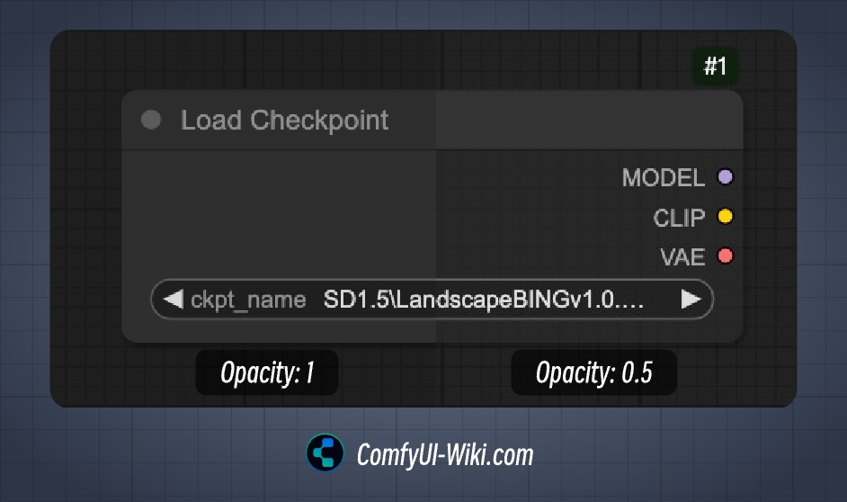 This option mainly affects the background color opacity of the node, with values ranging from 0.1 to 1, where a smaller value makes the background color more transparent.
Node Widget
Textarea Widget Font Size
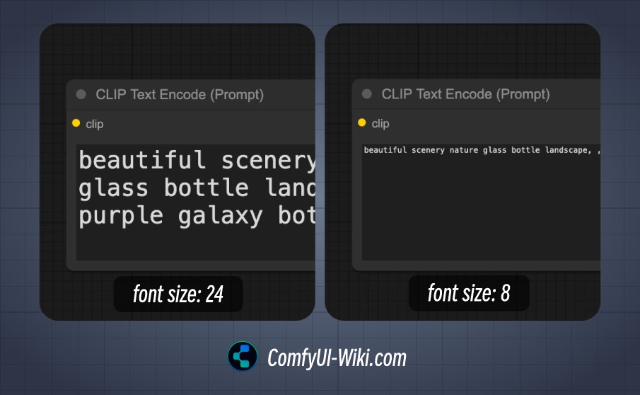
When the corresponding node has a textarea input, this option determines the font size of the textarea, with a minimum of 8 and a maximum of 24.
Sidebar
Sidebar Size
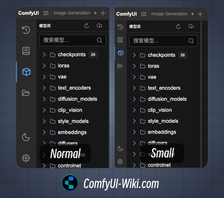 Sidebar size conditions:
- Normal: Normal sidebar size
- Small: Small sidebar size
Sidebar Location
Sidebar location: Left / Right
Tree Explorer
Tree Explorer Item Padding
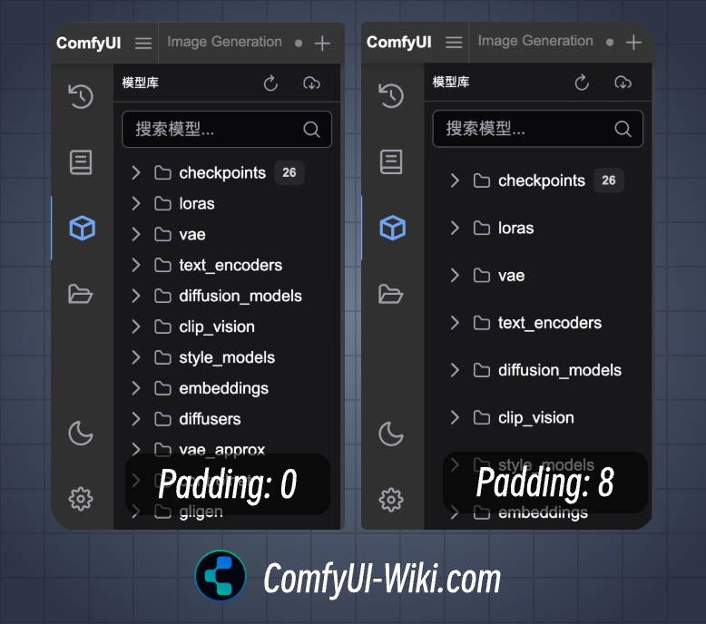 Set the padding for the sidebar menu, supporting padding settings from 0 to 8.