Skip to content
Help ComfyUI Wiki remove ads Become a Patron
Menu and Interface6. Interface Menu

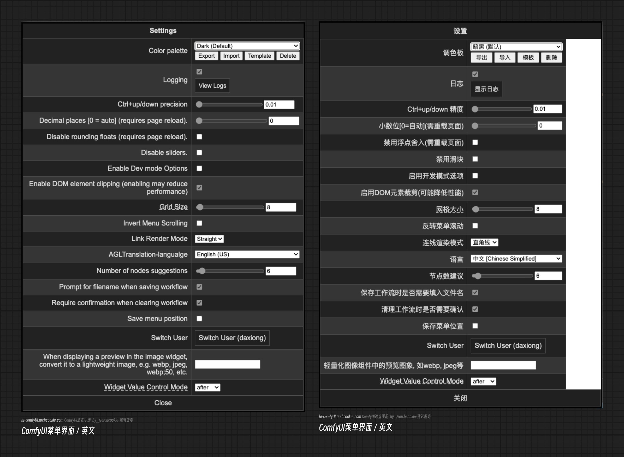
ComfyUI System Menu Settings Options

ComfyUI System Menu Settings Options

Color Palette | ComfyUI Custom Theme Settings - Color Palette

The color palette is mainly used for system color theme settings, supporting custom settings and management of the ComfyUI interface theme through json files. The default themes provided by ComfyUI are as follows:

  • dark dark
ComfyUI-dark dark theme
  • light bright
ComfyUI-light bright theme
  • arc
ComfyUI-arc theme
  • solarized overexposure
ComfyUI-solarized overexposure theme
  • nord theme
ComfyUI-nord theme
  • Github repository style
ComfyUI-github repository theme

Theme Menu Operations

ComfyUI supports setting themes through JSON files. The image below corresponds to the functions of the theme menu.

ComfyUI-Color Theme Settings Options

Customize ComfyUI Theme Colors

Following the previous step, you can download the corresponding JSON theme template for operation. The corresponding JSON configuration options are explained as follows: Note that the following JSON format will report an error due to the added comments. The comments below are only used to explain the configuration items. Please delete the comments when actually using them, or download the theme template from ComfyUI for modification.

{
  // ID: The unique identifier for this color palette
  "id": "my_color_palette_unique_id",
  // Name: The name of the color palette
  "name": "My Color Palette",
  // Colors: Contains color settings for different parts
  "colors": {
    // node_slot: Color settings related to node slots
    "node_slot": {
      // BOOLEAN: The color of the BOOLEAN type node
      "BOOLEAN": "",
      // CLIP: The color of the CLIP type node
      "CLIP": "",
      // CLIP_VISION: The color of the CLIP_VISION type node
      "CLIP_VISION": "",
      // CLIP_VISION_OUTPUT: The color of the CLIP_VISION_OUTPUT type node
      "CLIP_VISION_OUTPUT": "",
      // CONDITIONING: The color of the CONDITIONING type node
      "CONDITIONING": "",
      // CONTROL_NET: The color of the CONTROL_NET type node
      "CONTROL_NET": "",
      // FLOAT: The color of the FLOAT type node
      "FLOAT": "",
      // GLIGEN: The color of the GLIGEN type node
      "GLIGEN": "",
      // IMAGE: The color of the IMAGE type node
      "IMAGE": "",
      // IMAGEUPLOAD: The color of the IMAGEUPLOAD type node
      "IMAGEUPLOAD": "",
      // INT: The color of the INT type node
      "INT": "",
      // LATENT: The color of the LATENT type node
      "LATENT": "",
      // MASK: The color of the MASK type node
      "MASK": "",
      // MODEL: The color of the MODEL type node
      "MODEL": "",
      // SAMPLER: The color of the SAMPLER type node
      "SAMPLER": "",
      // SIGMAS: The color of the SIGMAS type node
      "SIGMAS": "",
      // STRING: The color of the STRING type node
      "STRING": "",
      // STYLE_MODEL: The color of the STYLE_MODEL type node
      "STYLE_MODEL": "",
      // UPSCALE_MODEL: The color of the UPSCALE_MODEL type node
      "UPSCALE_MODEL": "",
      // VAE: The color of the VAE type node
      "VAE": ""
    },
    // litegraph_base: LiteGraph base environment-related color settings
    "litegraph_base": {
      // BACKGROUND_IMAGE: Background image color (may refer to background transparency or style)
      "BACKGROUND_IMAGE": "",
      // CLEAR_BACKGROUND_COLOR: Clear background color
      "CLEAR_BACKGROUND_COLOR": "",
      // NODE_TITLE_COLOR: Node title color
      "NODE_TITLE_COLOR": "",
      // NODE_SELECTED_TITLE_COLOR: Selected node title color
      "NODE_SELECTED_TITLE_COLOR": "",
      // NODE_TEXT_SIZE: Node text font size
      "NODE_TEXT_SIZE": "",
      // NODE_TEXT_COLOR: Node text color
      "NODE_TEXT_COLOR": "",
      // NODE_SUBTEXT_SIZE: Node subtext font size
      "NODE_SUBTEXT_SIZE": "",
      // NODE_DEFAULT_COLOR: Node default color
      "NODE_DEFAULT_COLOR": "",
      // NODE_DEFAULT_BGCOLOR: Node default background color
      "NODE_DEFAULT_BGCOLOR": "",
      // NODE_DEFAULT_BOXCOLOR: Node box default color
      "NODE_DEFAULT_BOXCOLOR": "",
      // NODE_DEFAULT_SHAPE: Node default shape
      "NODE_DEFAULT_SHAPE": "",
      // NODE_BOX_OUTLINE_COLOR: Node box outline color
      "NODE_BOX_OUTLINE_COLOR": "",
      // DEFAULT_SHADOW_COLOR: Default shadow color
      "DEFAULT_SHADOW_COLOR": "",
      // DEFAULT_GROUP_FONT: Default group font
      "DEFAULT_GROUP_FONT": "",
      // WIDGET_BGCOLOR: Widget background color
      "WIDGET_BGCOLOR": "",
      // WIDGET_OUTLINE_COLOR: Widget outline color
      "WIDGET_OUTLINE_COLOR": "",
      // WIDGET_TEXT_COLOR: Widget text color
      "WIDGET_TEXT_COLOR": "",
      // WIDGET_SECONDARY_TEXT_COLOR: Widget secondary text color
      "WIDGET_SECONDARY_TEXT_COLOR": "",
      // LINK_COLOR: Link color
      "LINK_COLOR": "",
      // EVENT_LINK_COLOR: Event link color
      "EVENT_LINK_COLOR": "",
      // CONNECTING_LINK_COLOR: Connecting link color
      "CONNECTING_LINK_COLOR": ""
    },
    // comfy_base: ComfyUI interface base color settings
    "comfy_base": {
      // fg-color: Foreground color
      "fg-color": "",
      // bg-color: Background color
      "bg-color": "",
      // comfy-menu-bg: ComfyUI menu background color
      "comfy-menu-bg": "",
      // comfy-input-bg: ComfyUI input box background color
      "comfy-input-bg": "",
      // input-text: Input box text color
      "input-text": "",
      // descrip-text: Description text color
      "descrip-text": "",
      // drag-text: Drag text color
      "drag-text": "",
      // error-text: Error text color
      "error-text": "",
      // border-color: Border color
      "border-color": "",
      // tr-even-bg-color: Even row background color
      "tr-even-bg-color": "",
      // tr-odd-bg-color: Odd row background color
      "tr-odd-bg-color": ""
    }
  }
}

Logging

Logging options are primarily used to display ComfyUI’s loading logs, including information on plugin component loading, etc.

ComfyUI-Logging Options

After clicking to display logs, you can view specific log information in a pop-up window.

ComfyUI-Log Information

Ctrl+Up / Down Precision Settings

ComfyUI allows you to quickly increase or decrease the weight of the selected prompt in the text prompt using the shortcut keys Ctrl+Up / Down. This option can set the increment or decrement of the weight for the prompt each time the shortcut keys are used.


Decimal Places [0=Auto] (Requires Page Reload)

To be updated.

Disable Rounding Floats (Requires Page Reload)

To be updated.

Disable Sliders

To be updated.

Enable Dev Mode Options

To be updated.

Enable DOM Element Clipping (Enabling May Reduce Performance)

To be updated.

Grid Size

Used to adjust the size of the background grid in the ComfyUI interface.


Invert Menu Scrolling

To be updated.

Number of Nodes Suggestions

This option mainly affects the connection line style between different nodes in ComfyUI. Currently, ComfyUI provides 4 types of connection line styles, and the meanings of the different options are as follows:

  • Straight
  • Linear
  • Hidden
  • Spline

Prompt for Filename When Saving Workflow

To be updated.

Require Confirmation When Clearing Workflow

To be updated.

Save Menu Position

To be updated.

When Displaying a Preview in the Image Widget, Convert It to a Lightweight Image, e.g., WebP, JPEG, WebP;50, etc.

To be updated.

Widget Value Control Mode

To be updated.