Menu Settings - ComfyUI Menu Configuration
This section mainly explains the functionalities related to the ComfyUI settings menu.
- The settings menu for ComfyUI Desktop differs slightly from other versions.
- The old version menu has been completely revamped after iterations.
How to Access the Settings Menu
ComfyUI currently has both new and old versions of the UI, which can be switched in the settings menu.
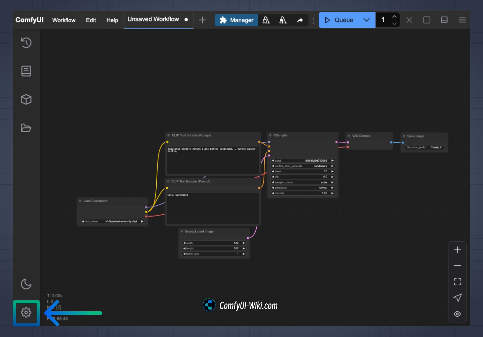
New Version ComfyUI Interface Menu Access
If you are using the new version (default) interface, click the gear icon on the screen to open the settings menu, as indicated by the arrow in the image below.
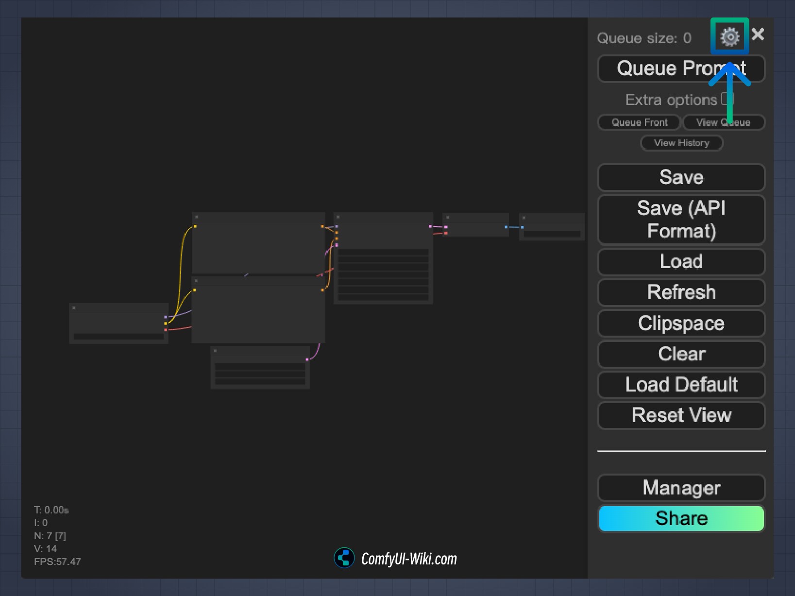
Old Version ComfyUI Interface Menu Access
If you have switched to the old version interface, click the gear icon to enter the settings menu, as indicated by the arrow in the image below.
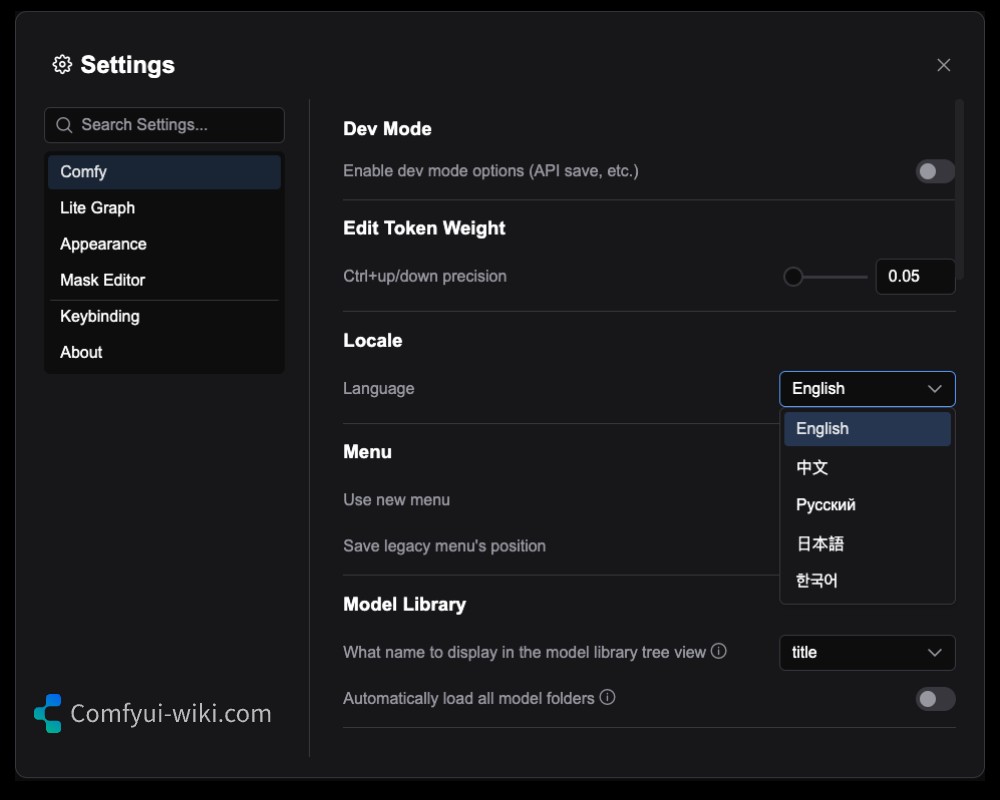
Detailed Menu Settings Explanation
The explanations for each part of the corresponding menu settings are as follows. Please visit the corresponding articles for detailed menu settings explanations.
- Comfy
- Screen (Lite Graph)
- Appearance
- Mask Editor
- Comfy Desktop (Comfy-Desktop)
- Keybinding
- Extension
- Server Configuration
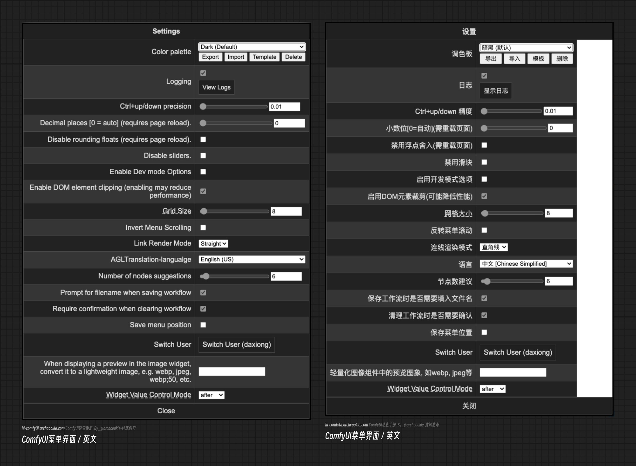
Old Version Menu Interface
This section retains screenshots of the old version ComfyUI menu. If you are using a much older version of ComfyUI, you should be able to see this interface. However, due to updates in ComfyUI, this article will not provide detailed explanations for this part of the menu.